Thursday, 18 April 2013

Final Products

FINAL PRODUCTS

These are my final designs. My front cover, then contents and finally my double page spread. I stuck to the theme throughout and I created a magazine that would suit well to my target audience.


Monday, 15 April 2013

Evaluation

How does your media product represent particular social groups?


Evaluation

In what ways does your product use, develop or challenge forms and conventions of real media products?


When creating my front cover I used ideas from current music magazines to help me develop and challenge forms of media products. I made sure the theme colours worked well with the genre and that they followed all the way through. I used an image as the background to show what my double page spread was about which I found many music magazines did. I then planned my front cover text to make the page look full but still able to understand and see the background image. By using older text this kept with the genre and it challenged the conventions of real media products. 
 
For my contents page I carried out more research and took ideas from current magazines. I found that most magazines kept all their text to one side so that readers could find the information they wanted easily. Also they tended to keep the text quite small and made the pictures bigger, but doing this to my contents page, it will interest the audience more because they tend to look at the pictures more to see who is featured in the magazine. Plus my making the competition more obvious they will me more interested in entering. This shows the conventions on real media because it has all the same structure as a real magazine.


Finally for my double page spread I again did the research on current magazines and had to make a choice on whether to keep the text to one side or whether to have half and half. I decided to put it all on one side, by doing this it meant I could highlight the main subject (the band) with a bigger title and it meant the picture wasn’t covered up.

Once I had positioned the main picture and the title, I carried onto the text, I decided to make it a questions article which the band had answered, by doing this it would interest the reader because it would have the best gossip in the article which is what all main magazines have. By structuring the pages like this and creating my article into questions it entices the reader, again showing the conventions of a real media product.


Thursday, 11 April 2013

Evaluation

What have you learnt about technologies from the process of constructing this product?

Strengths- In the magazine industry computering technology is a must have throughout. When constructing my product, there were many strengths to the use of technology. When planning my designs and creating my flatplan it was easier to create it on the computer because it meant I could use the exact measurements because everything would fit perfect as the same as the flatplan. Furthermore the programme I used (InDesign) worked a lot better than any other programme because it is specifically created to design media products. I found using InDesign mean't I could experiment with different textures and change the fonts and structure easily. Moreover, when creating my blog it was much easier to keep track of everything I was doing and I had easy access to updating and changing my blog if I needed. Over all, I learnt how to use InDesign well and I found that having easy access to my plan and my blog meant that I was sticking to my initial ideas well. 

Weaknesses- As for most things there are weaknesses for everything. When designing my product I found that indesign couldn't do everything I wished for my product so I had to compromise with it and change my design ideas slightly. Also, I found that when creating my blog it was hard to structure it how I wanted it so I found working with blogger was harder than expected. 

Altogether I have learnt a great amount when constructing this product, I have learnt how to use indesign well and I have learnt how to keep track of my work and keep a time scale using a blog. Furthermore I have found usng technology to construct my product has made it a lot easier and found it would of taken a lot more time if I didnt have the programmes available to me.

Looking back at your preliminary task, what do you feel you have learnt in the progression from it to the full product.

Looking back at my preliminary task and the progression throughout, I feel that I have learnt how much work has to be put into creating a media product. I found that everytime I planned something to create my magazine I had to make sure I had done research prep to make sure that the customer would be satisfied with it. Furthermore, throughout the progression I found that everything had to fit to my target audience, so I was making sure my research was well thought through so that my magazine interested my target audience completely.
I feel I have learnt that the target audience is the most important part of creating a media product. 
Moreover, I feel that I have learnt how to attract a certain type of audience well, I've learnt how to make a magazine look presentable to the eye of the reader, and I have also learnt how to develop my ideas as I go, always doing research to help my development.
In addition, I feel my technology skills have improved a lot. I am able to use blogger easier than when I started off and I am also comfortable creating media products in InDesign.


Tuesday, 9 April 2013

Evaluation

Who would be the audience for your media product?

When designing my magazine I needed to choose a target audience to appeal too. I chose to design my magazine for the age range of 15-30 year olds with a interest of rock music. My typical stereotype of audience is dark coloured clothing, skinny jeans and band tops or patterned tops. Furthermore the girls tend to wear dark makeup, that makes them stand out to be original. Piercings and tattoos are very common with my target audience. Although they tend to wear dark colour sometimes they can vary with bright colour for hair dye or small parts of clothing. They like to keep to their group and as a rock listener they wil follow certain bands and stick to them. This means they will choose certain magazines because of the certain bands inside.


How did you attract/ address your audience?
I looked at current magazines and I also researched what these group would look for in a magazine and what they look like. I feel my magazine will suit these the most because I have suited it to fit them. 
The dark colours that I have used in my theme are the main colours that my target audience will normally associate with. Furthmore I looked at the way bands pose in the images in the magazines and I attempted to recreate these poses in my images. By doing this it makes the bands look professional and they suit my audience and how they like to see their favourite bands.When researching the current magazines I looked at the bands that were mostly used in all of the magazines and how much content they got. By doing this it meant I could work out how much content to use for my double page spread.


Sunday, 7 April 2013

Evaluation

What kind of media institution might distribute your media product and why?


Publishing-When creating my magazine I had to decide ways in which I could make it available to my target audience. I chose to use IPC Media as my publishing because they are one of the leading publishing companies in the UK. Also magazines such as 'NME magazine' and 'Guitar & Bass' both use IPC Media as their publisher. Both these magazines are well known music magazines so IPC have a reputation when I comes to publishing music.

Distribution-
    • As a main form distribution I chose the traditional method of printing and manual transport in the local areas. By doing this I would be able to produce mass amount of the magazine, or I would be able to choose the amount needed for the area. I'd be able to choose this by finding out how many are bought every week in the area.   
     
    • Furthermore, to get the designs of my magazine
    delivered to all the printing companies in the country in time without rushing the editing or journalists I decided to use technology and send all the companies my designs through email. This way it meant that I wouldn't have to rush the rest of the production process and that the deadlines could stay as they were because by sending the designs by email the printing could be complete and transported in the same night ready for the next morning.
    •  In addition to distributing my magazine traditionally I wanted to make sure that everyone could read the contents even if they couldnt afford to buy it every week. I decided I would put my magazine on the web 2.0. By doing this it would mean that anyone that wanted to read it would have access to it at any point of the day. Also by my magazine being online, it would mean if collectors missed a week they would be able to find it without hassle. 

Monday, 18 March 2013

Progress through design

Progress through my designs. 


 With my front cover I followed my plan and chose to use red, black and grey for my colour scheme. By using these colours it will show the target audience the type of magazine better when the main image is added. Furthermore, I've decided to add the text and the design work first so that I can get a vague idea of what it will look like, I have made sure the picture will be easily viewable on the front and will still be the main attraction.

I have started to add the main band information to the piece and I've chosen the fonts. I chose to use different fonts because it made it stand out more as the main subject and the font for the title of the magazine is easily recognised. I added a barcode so that it can be sold in shops. I also added a small paragraph underneath the band title so that the target audience would be more dragged in by the contents and want to buy the magazine.

After adding the text underneath the band title, I added smaller paragraphs around the page, these are to advertise what else is in the magazine which will attract the readers more. I changed the colour of the text to white with a red outline so it highlights them better over the image which will be in the background. Moreover, I added the issue number in the corner and the date so people would understand which week it was. I then added the imagine into the background to finish my front cover.


For the contents page I decided I wanted to use a grey background and use a slight fade of white in it so that it looked more professional. I added the title to the top of the page and made it spread accross so that the audience could see the page clearly. By having it in red with a black strip behind it, it makes it stand out to the audience and they will understand the page quicker. 

Next I added pictures of the competition that is advertised on the front page. By using the spiky shape for the WIN, this makes it stand out more and it will attract the audiences eye so they will consider the competition. Furthermore, if they didn't understand what the competition prize is, I added a picture showing the prize so the audience had a better understanding. I added the page number so that when reading the contents page they knew how many pages they needed to change too. 

Once I was happy with the competition advert I added the pictures to the page and then i began to add the the text. I decided to put it on the left hand side because it meant it was the first thing read and it meant the audience could find what they needed without having to search for it too much. I highlighted the pages in white text with a red outline again, sticking to the theme and put a small description underneath. By doing this for each page the audience new what to expect and they can decide whether they want to buy it or not.


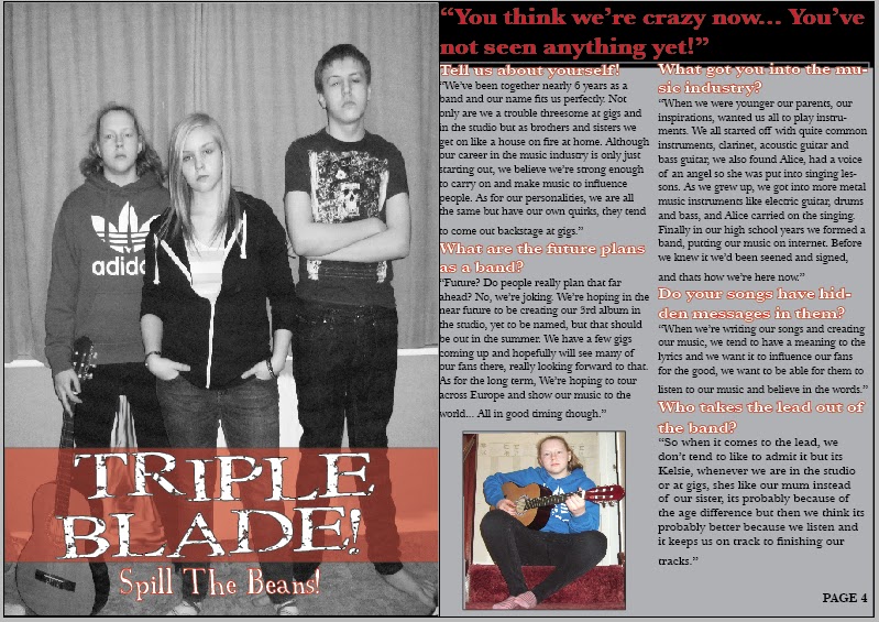
 For my double page spread I used the same background as the contents page, sticking with the theme throughout the magazine so that the magazine looks presentable in the style I have chosen. The first thing I did was add my image onto the first page. I then added the title of the band "Triple Blade!" onto the top of picture. So the text will be over lapping the image.

After, I added another picture so that I could space my text around it well. I added a quote at the top of the page. By doing this it will attract the audience into reading the article because it will make them wonder what the quote is about. 
I made the writing red with a black strip to make it stand out from the rest and it stuck to the theme of the magazine still.

Once I had made sure everything was formatted to fit on the page, I started to write my article. I decided the article would be more of a survey of questions that had been asked to the band and their responses. By doing this it entices the audience more because I have picked out certain things that the audience will want to know. I highlighted the questions I asked by making them bold and with an outline of red, this means the target audience will be able to recognise who is who talking. .  


Monday, 28 January 2013

Proposal and Flatplan

Proposal

  • My target audience for my magazine will be within the age range of 15-30 who are interested in the genre of rock. I have chosen this age range because it means I can use new bands and my target audience will know who they are.
  • My magazine will be about rock bands that are new and upcoming. There will be articles about new bands starting in the industry. By using new bands it will educate my target audience which will help the new bands with advertising and it will also give my target audience chance to listen to a new band. 
  • For my cover lines I want to be able to draw the reader in and I want to be able to make them want to read the articles. I want my cover lines to be gossip about the bands to entice the reader.
  • I havent completely agreed on a title for my magazine yet but I have a few ideas. I may use either Baseline, Treble Beat or 40STM.
  •  For fonts I will probably use Arial for the text in the double page spread because it makes it easier for the audience to read and this will be the same for the contents page. For the front cover I will use more gothic fonts to suit the genre of the music and to interest the audience. For all the titles I will use gothic fonts as well. 
  • My magazine will be weekly issued so that the audience have something they can commit too and become very interested in. Every week will include a double page spread of a different band so that the audience don't become bored. 
  • For the front cover I will use the main band as the background and then add smaller pictures of other bands included as well. I will also include an image of the competition involved in the magazine. The images that are put on my front cover will be taken by myself and produced by myself too. 
  • The magazine I create will be normal A4 size. 
  • For both the front cover and the contents page, I will use either red or green mixed with black and grey. These are typical colours that will attract my audience to the magazine. 
  • To produce my images I will be taking pictures of a new band I am in contact with and then I will edit them on indesign before adding them to my magazine. 


For my magazine to work I need everything to look messy on the page. I need to make sure my audience are completely enticed by the designs so they don't become bored easily. For the front cover I have placed the images around the page, making sure that the background of the band can still be seen but also they are visible. The text has been dotted around so that the audience have to look properly to read all the information. I have made sure the title and the cover line are bold but at the same time not obstructing the background view. 
  
For the contents page I again have dotted everything around so that the audience get a full understanding of what is included in the magazine. The main focus of the page will be the pictures because the audience are going to be more interested if they know the bands involved. So i have decided to use a lot of images to improve the chances of reading the magazine. The text is to one side and in big blocks this is because then the audience can easily identify what page they want instead of having to search so much. The title is out of the way but still bold so the audience know what page they are on.

Finally, the double page spread has been split to make sure that the audience can see all the pictures used, there are blocks of text for the article to be used and the band name will be in bold to make sure the audience know what page they are on and what band they are looking at. 

Monday, 7 January 2013

Research-Music Magazine


Research

Both these magazines are aimed at people that like rock music or metal. The front covers use bright colours that contrast together to make the magazine stand out. The pictures used are of bands or band members that are well known for the rock music, also they are pictures of the main story in the magazine. The font used on the front covers are very grim and edgy. This gives the magazine a sense of danger and attracts its target audience better.
The contents pages have been created to highlight the pictures more and to make the target audience want to look at the pictures and identify the bands better. The content carries on with the theme colours as well making sure the audience are still interested all the way through. 
Furthermore on the front cover both have got competition entries or merchandise offers that are available. By the magazines showing these offers on the front page it entices the target audience to buy the magazine so they can get the offers. Moreover where the merchandise is advertised it takes up over a quarter of the page so it shows this is one of there main strengths in selling the magazine. 
On both magazines the main cover line is about the main band the magazine has covered that week. By doing this it shows the popular band and it means they are able to use persuasive writing to draw the readers in. With the other cover lines they are made to stand out in either saturated boxes or they use the same colour as the main title. by doing this it shows what else is on offer in the magazine and it also shows that all the other bands are still just as important as the main story.
With the content pages, the text is the smallest part. Although the text is important, it is the smallest because they have so much to pack it. Also the readers wont take much notice of the text they will mainly scan it and look for the information they need. By keeping the text small they are able to enhance the pictures and interest the reader more. On the content page it is more about how it is all laid out instead of the design. The theme is simple, still making sure it attracts the readers attention but also gets its point across without distraction.

Overall these magazine represent their themes well and they portray the music genre through colour and pictures. When creating my magazine I need to make sure I am able to do this so that the reader is clear on what the magazine is about and so I attract the right target audience. I need to make sure I have a lot of pictures to show and that the type of text I use keeps to the theme as well. 


To help with my research I created a questionnaire to find out how many people buy magazines and how often they do. Once I had created it I handed it out to 30 people and recorded the responses. I found that no matter the age range, not many people are buying magazines at the moment because of the internet availability. If people where buying the magazines it was mainly the genre of rock that was bought. This i found positive because this is the genre my magazine will be designed as. Furthermore, in the final question the main answer tended to be bands. This answer will help me the most because it will help with the design of my magazine and what to include in the production. 


Magazine Questionnaire


This questionnaire will help design a new magazine with a genre of metal and rock. 
Please circle one of the answers for each question.

1-   Age?
a.   13-16
b.   17-20
c.    21-25
d.   26+
2-   Do you read magazines?
a.   Yes
b.   No
3-   If yes, how often?
a.   Everyday
b.   Once a week
c.    Once a Month
d.   Rarely
4-   What genre of music do you look for?
a.   Pop
b.   Rock
c.    Rap
d.   Indie
e.   Classical
5-   What do you look for in a magazine?
a.   Bands
b.   Articles
c.    Merchandise
d.   Advertising